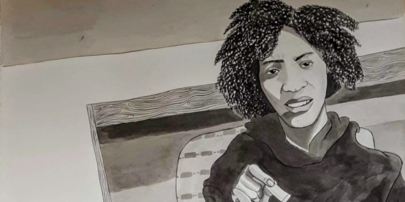
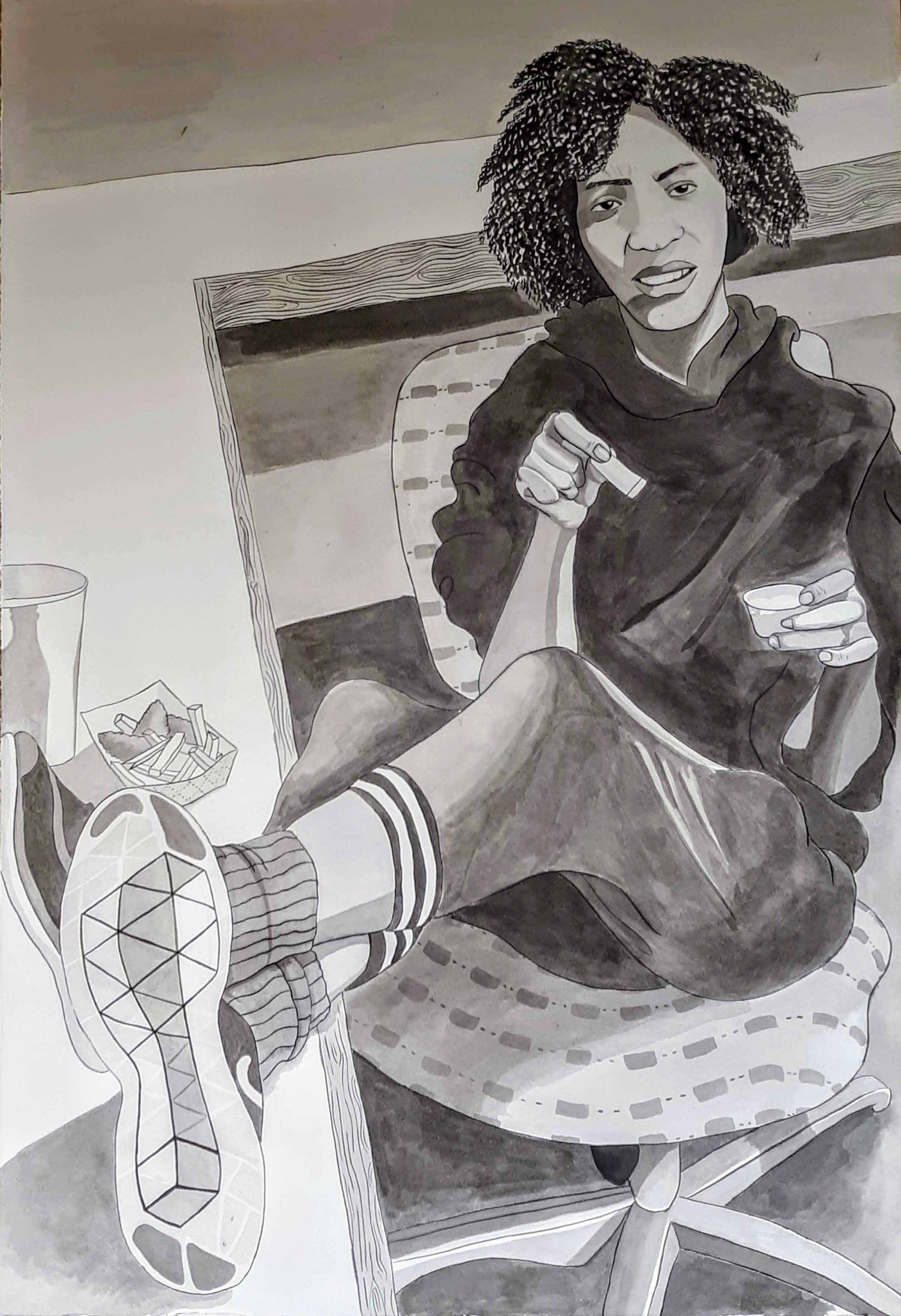
Figure Study “Self-Portrait”

Figure Study


[Context: I made this 24 x 14 cm India ink self portrait for my upper level drawing class. The focus of the class that semester had been the human figure, and for one of our final assignments in the class  we had to create life sized self-portraits. This piece holds significance in that it was a challenge in its creation, with a long lasting reward. Agnes Scott purchased this piece as to student work to be displayed in the campus student center. This was the first piece (a big one at that) that I've ever sold or that anyone has paid me for, which really opened my eyes to the value of my work. As any type of creative, especially a freelance one, it is common for people to undervalue the work that you do, and thus you undervalue your self. This assignment and experience really helped appreciate how far I've come in skill (and potential of what I can do) as well as my ability to sell my work.]

Self – Portrait

When assigned this project, I immediately knew I didn’t want to do the typical “angsty” and “dramatic” pose or face because it isn’t representative of the multiple facets of my personality. My self-portrait conveys annoyance and precociousness, but all in good humor. I looked angry but something in the face and the relaxed position of the body signifies something else. 

The most engaging aspect of this piece for me is the face and the feet–the face because its expressive nature and the feet because they are in the front (in your face) and they have a lot detail.

The medium used for this self-portrait is all India ink. The black outline is pure India Ink, but the rest is all variations of wash. The figure almost occupies the entirety of the page, while also managing to go back into space. 

The background counter provides a hard geometric line to contrast and ground the organic forms that make up the figure. I omitted some of the background objects and left the counter white to emphasize the shadow of the feet and the food.  

The style of my of self-portrait is my attempt to reconcile representative with “abstraction”. The result of this reconciliation is a Graphic style, one that tries to simplify certain aspects of reality but still giving enough detail for it to have dimension. Ideally, I wanted more “pure” blacks in the piece to enhance said graphic quality, but it still works out.

Leave a Reply

Your email address will not be published. Required fields are marked *

css.php